In this blog, I will show you how to set css dynamically on datepicker according to your requirement using jquery.
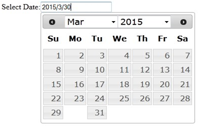
By default, it is showing like below:
You can create a single function to change the view of the calendar, as shown below:
 function ChangeView(){
 setTimeout(function () {
		$('.ui-datepicker .ui-datepicker-header').addClass('Calender-Header');
		$('.ui-datepicker').css('background','none repeat scroll 0 0 buttonshadow');
		$('.ui-datepicker .ui-datepicker-header').addClass('Calender-Header');
		$('.ui-datepicker .ui-state-default').addClass('Calender-Header');
		$('.WebsitePage.ui-datepicker td').addClass('Calender-Button');
		$('.ui-datepicker .ui-widget-header .ui-state-default.ui-state-highlight')
                  .addClass('Calender-Header');
		$('.ui-datepicker-calendar').addClass('Content');
		$('.ui-datepicker select.ui-datepicker-month').addClass('Calender-Header');
		$('.ui-datepicker select.ui-datepicker-year').addClass('Calender-Header');		}, 5);
 }
And add the classes which are defined in above function accoding to the color:
 <style type="text/css">
 .left {float:left;}
 .ui-state-focus{background:none ! important;border:1px solid #d3d3d3 ! important;font-size:12px;}
 .ui-state-hover{background:none ! important;color:#fff ! important;border:none ! important;}
 .ui-datepicker .ui-datepicker-prev-hover{left:2px;top:2px;cursor:pointer;}
 .ui-datepicker .ui-datepicker-next-hover{right:2px;top:2px;cursor:pointer;}
 .ui-state-default .ui-icon{background:url("http://drupal.org/files/issues/ui-icons-222222-256x240.png")
  !important; background-position: 190px 224px !important;}
 .ui-button.ui-widget{background:#fff ! important;}
 .ui-datepicker .ui-datepicker-header{padding : 0px !important;font-weight:normal ! important;}
 .ui-datepicker .ui-datepicker-prev span, .ui-datepicker
 .ui-datepicker-next span{margin-top: -10px !important;}
 .Calender-Button:hover { background: none !important;color: #000 ! important;}
 .Calender-Header{background: #FF6D00;color: #fff ! important;}
 .Calender-Header:hover{background: #FF6D00;color: #fff ! important;}
 .Calender-Button{background: #FF6D00;color: #fff ! important;}
 .Background-Alternate{background: #FF6D00;color: #fff ! important;}
 .Content{background: none repeat scroll 0 0 #d2b48c;color: #fff ! important;}
 .ui-state-default.Calender-Header{background: red;color: #fff ! important;}
 </style>
Now when click on input box calendar, it would be with new css. For this we need to call above function on click of input box.
This is the HTML of input field:
 <div class="container">
	 <div class="date-head left">Select Date:</div>
	 <div class="enter-date"><input type="text"  class="adate"/></div>
 </div>
This is the script to call the function:
 $( ".adate").click(function(){
	ChangeView()
 });
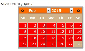
After this, the datepicker will look like below:
Now, When click on next or previous buttons, it will show default calendar css. For rectify that, we need to call same function on next or previous click event.
 $(document).on('click','.ui-datepicker-next',function(){
     ChangeView()
   });
 $(document).on('click','.ui-datepicker-prev',function(){
     ChangeView();
  });
 This will show same css.
Now, while selecting month or year from the dropdown, it will show the default css. To rectify that, we would need to call the same function on “onChangeMonthYear” attr as shown below:
 var now = new Date();
	var month = now.getMonth() + 1;
	var today = now.getFullYear() + '/' + month  + '/' + now.getDate();
	var date_Format = "mm/dd/yy";
	$( ".adate").val(today);
	var d = new Date();
	var CurrentYear = d.getFullYear();
	$( ".adate" ).datepicker({
		dateFormat		:   date_Format,
		onSelect		:   function(dateText, inst) {
			date 		=   $(this).val();
      		 },
		changeMonth		:   true,
		changeYear		:   true,
		yearRange 		:   "1901:CurrentYear",
		onChangeMonthYear	: function (year, month, inst) {
			ChangeView();
		}
	});
I hope above will help you in customizing the datepicker as per your website.


