Bootstrap is the most popular HTML, CSS and JS framework for developing responsive websites, mobile first website. It is free, easy to use and open-source collection of tools for creating websites and web applications, which makes it the most popular among developers. It consists of CSS and JS files which help you in making your webpage responsive.
It is hosted on GitHub and can be downloaded from there and used. It is one of the most-starred project till March 2015.
Bootstrap has predefined, easy to understand, class names which makes it user friendly and easy to use.
The latest version of Bootstrap is v3.3.4. You can also use CDN links of the CSS and JS files.
If you download it, make sure you give proper path to the required CSS and JS files.
Understanding the File Structure:
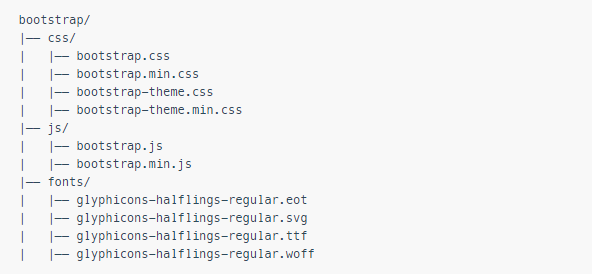
So here we get compiled CSS and JS files, with their minified version of files too.
The fonts file includes 200 icons from the Glyphicon Halfilings set.
Now, we start with the process of creating a webpage using Bootstrap:
1) Create a basic HTML file.
2) Include the CSS and JS file of Bootstrap.
 <!DOCTYPE html>
 <html>
 <head>
    <title>Basic HTML File</title>
    <meta charset="UTF-8">
   <meta name="viewport" content="width=device-width, initial-scale=1.0">
    <link rel="stylesheet" type="text/css" href="../css/bootstrap.min.css">
   <script src="http://code.jquery.com/jquery.min.js"> </script>
    <script src="../js/bootstrap.min.js"> </script>
 </head>
 <body>
     <h1>Hello, world! </h1>
 </body>
 </html>
Save this file with extension “.html” and it will be a responsive web page, which will work for all size of screens.
Build a page with navigation, using the pre-defined class names, such as “nav”, “nav-bar”, etc. and see the effect.
Source:
http://getbootstrap.com/getting-started/.
http://en.wikipedia.org/wiki/Bootstrap_%28front-end_framework%29.


