Bootstrap is a frontend framework for design and create responsive website using HTML,CSS, JavaScript. In Market, there are many frontend frameworks like Bootstrap, Semantic UI, Foundation, Materialize, and Material UI.
Here is some example of HTML elements which represents in bootstrap style.
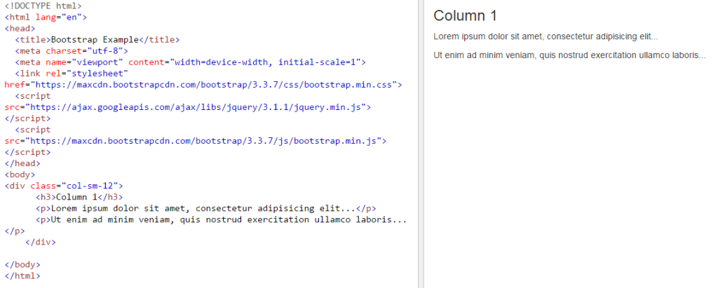
For example: If create a <Div> element in full width, then we can write as example below.
<div class=”col-sm-12″>
<h3>Column 1</h3>
<p>Lorem ipsum dolor sit amet, consectetur adipisicing elit…</p>
<p>Ut enim ad minim veniam, quis nostrud exercitation ullamco laboris…</p>
</div>
or using bootstrap framework, Download Bootstrap Zip folder from www.getbootstrap.com.
Bootstrap framework is used for create responsive websites or web applications . It means we do not need to apply extra effort for create responsive web sites, Bootstrap automatically maintains them. For use of bootstrap framework, always use bootstrap.min.css and bootstrap.min.js , and mention in <head> tag.
For create website for mobile view, add <meta> tag in <head> tag with attribute content having value width=device-width.Like below

There are some more examples uses in bootstrap framework,Like below:
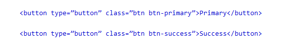
For button:
For Table:
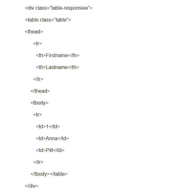
Class: table-responsive used for create table responsive. And class: btn btn-success is class for buttons.
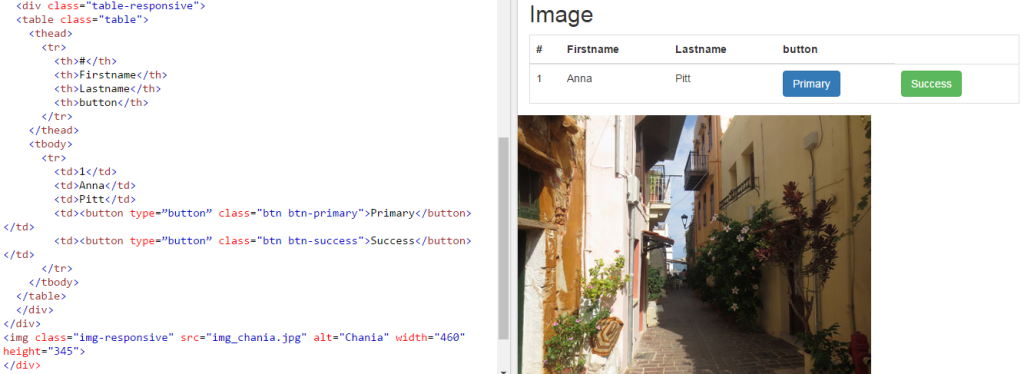
For image: To create image, in <img> tag add class: img-reponsive, which make image as responsive.


