Controls
Foundation provides the following controls-
- Button
- Button Group
- Close Button
- Slider
- Switch
Button – Foundation supports many button styles those can be customized as per our needs.
Buttons can be created using simple <a> tag or <button> tag or we can just use .button class.
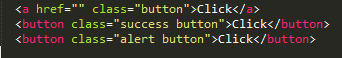
Output –
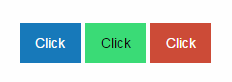
Button Color – Foundation provides some standard color classes but we can customize this as per our needs. There are following button colors-
Primary, secondary, success, alert, warning
Output –
Button Sizing – We can customize button size, Foundation provides following classes for button sizing.
Tiny, small, large, expanded
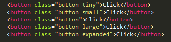
Output –
Addition Classes supported by Button in Foundation-
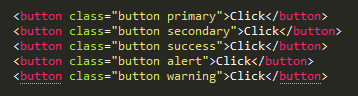
.disabled – This will make a button disable.
Output –

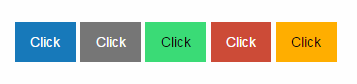
.hollow – By using this class we can make a hollow button.
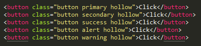
Output –
.dropdown – We can create a dropdown button using this class.
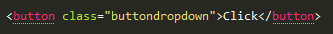
Output –

Button Group
Button group is used to create a collection of buttons, in this group all the created buttons separated by a small separator.
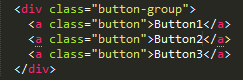
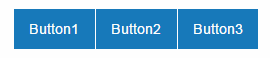
Output –
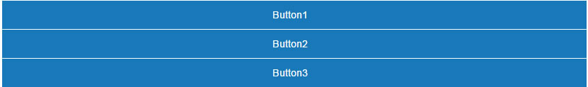
Stacking – a group of vertically arranged buttons can be created by using the class .stacked
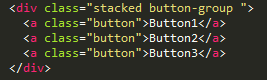
Output –
Reference –


